Book Covers: Cast Your Vote!
That is, THE COVER FOR MY BOOK! That’s right, Flashes of War is being designed by the book publishing majors at Loyala University Maryland’s Apprentice House as we speak and I received the first round of possible covers on Tuesday. I’ve narrowed it down to two, I think, and am very curious for reader feedback.

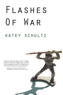
The designer is working on an additional version that would have an image/photo of an Afghan boy in the shadow of the toy American soldier–so the shadow would be the same shape, but rather than being a shadow it would be an image of a boy. Also, they’re going to add “short stories” somewhere in there, to indicate the book is a work of fiction. This is all in the draft stage, but I’ve never done this before and would appreciate any first impressions–from thumbs up, to thumbs down, to an entirely new design suggestion. I’m all ears!

Of these two, I prefer the grey background. The shadow idea sounds pretty cool! Great work Katie ~ how exciting to be at this stage!
The lefthand design works better for me because I find the blue shadow in the rightmost image really pulls my eye down there–where there's not, in fact, any useful information. You want the eye to enter the image in a strong emotional, interlocutory place, then travel to the title I think, or more specifically to the word "war." So the lefthand image would work even better if the weapon were pointed at a diagonal to the top left…but that soldier may not exist.
Katey, while the white cover shows the type in better contrast, providing readability – especially for the author's NAME (yay!) – war is never a black-and-white matter, and the grey is symbolic of that complexity. In terms of aesthetics, I like the look of the white cover a little better, and the face of the boy in the shadow will really tweak it, I agree. These decisions are not simple, and the more successful you are, the more decisions there will be. Mazal tov on publishing, Katey!
I immediately said the one on the right!
I really like the one on the LEFT but would love to see a little splash of red somewhere.
Well this is definitely no black-and-white answer for me! I like he grey for the top half but the white for the bottom half because it shows more clearly that this is a plastic toy and I think the shadow quality is better, though when this is replaced by the image of a boy perhaps it won't matter so much. That said, the comment about adding red has huge appeal. If you kept the white version but splashed red behind the title I think that would be awesome. and it doesn't have to indicate blood, there is plenty of other rad in war. "flashes" the red of lasers, explosions, etc.
Cool Stuff! You're at the really fun part now!
I like the one on the left. Easier to read. Text in dark grey is hard to read, I think.
i think the left also. i like the grey, but i agree the shadow on the grey is too distracting. the white background just feels cleaner and sharper.
Both look great to me, Katey, but the white background is clean and uncluttered, making the text easy to read. Looking forward to buying a copy!
Hi Katey! How exciting! My initial intuitive response was visually preferring the left one, with the white cover.
P.S I was so impressed with the YouTube of your t.v appearance on your book about the swinging bridges! Very impressive!
Namaste, Bryony XOXO
They're both great, but I like the white background better.
The white one. There's something funky with that shadow on the gray one, that throws it all off for me. Plus the white one tells a little story, in that you have a figure of a soldier in a flash of white, the shadow trailing off….
I like the white one. Cleaner. Easier to read.
I'm getting caught on the line around the shadow on the gray one, so I vote for the white.
less is more – the gray is more
The left one. I like the contrast of black on white. And the soldier stands out.